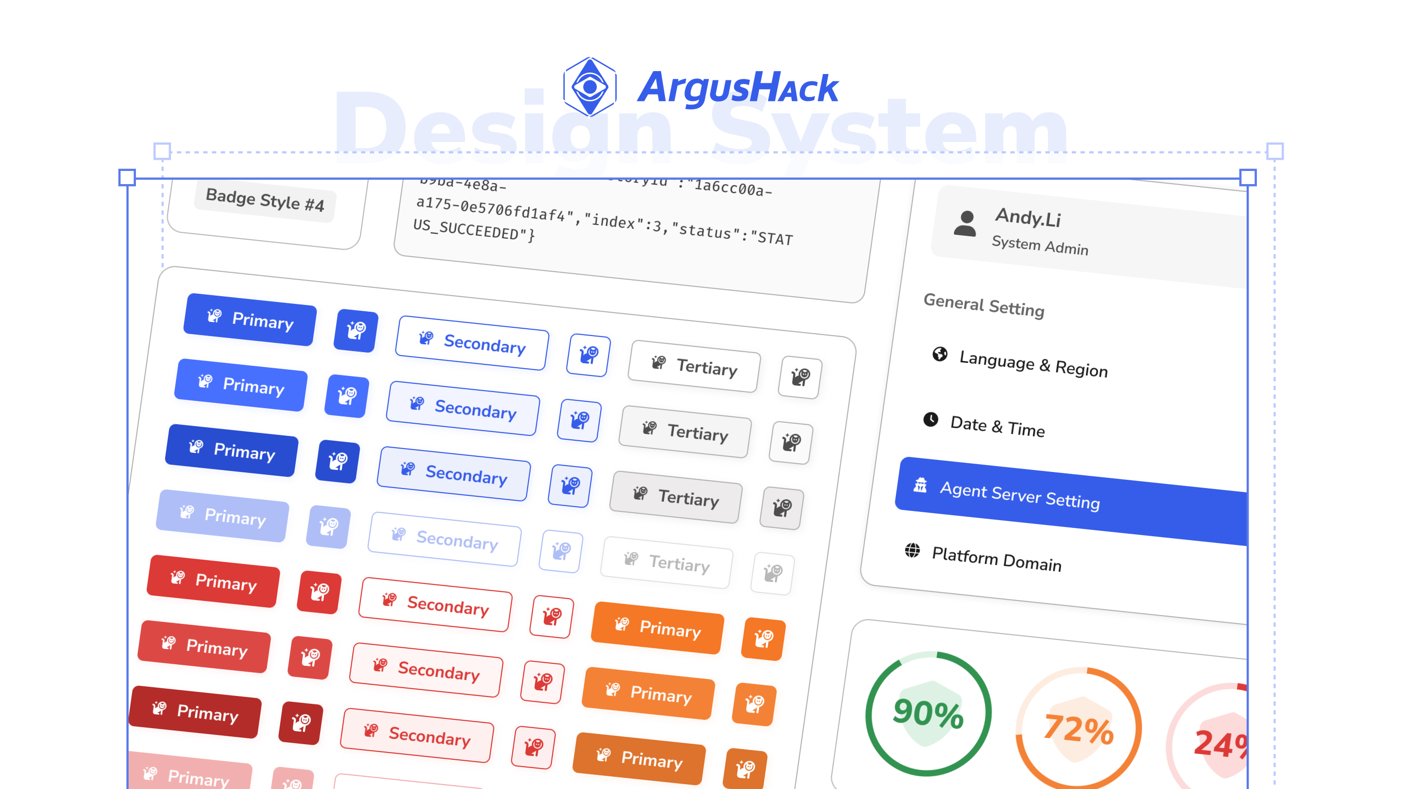
ArgusHack ─ Design System v2
Project Duration
About 9 months (2025 Q3 - 2026 Q1, run in parallel with other projects)
Development Process
Agile
Company
Leukocyte-Lab
Role
UI/UX Designer
Responsibilities
Pain-point collection & synthesis, design token planning, wireframes, mockups, component redesign, information hierarchy adjustments
Tools Used
Figma, Notion, Token Studio
Background & Problem
Background
When Design System v1 was first designed, the product's features were relatively simple, and the spec was built around the needs of that moment. As business strategy shifted, the features and data volume the product had to accommodate kept expanding, and the original spec gradually couldn't keep pace with the product's growth — so we kicked off the v2 redesign to support where the product stood and where it was headed.
Role & Output
Teamwork
Design System v1 was built jointly by me and the Design Lead; by v2, I became the lead designer — I handled everything from pain-point collection and synthesis, restructuring the token architecture, and redesigning components to adjusting the information hierarchy, while the Design Lead focused on converging direction and quality control.
Clarifying Pain Points
Pain Points
After taking on the redesign, we gathered pain points in three steps: the design team first took internal stock of v1's problems and set the redesign goals, then we consulted front-end teammates for their input, and finally I synthesized all the feedback into three major pain points as the basis for v2.
Step 1|Internal Design Team Review
Reviewed v1's usability issues and user feedback relayed by the business team together with the Design Lead, documenting them while nailing down the redesign's goals and priorities.
Live notes from the internal discussion, with pain points and task planning taking shape together
Step 2|Gathering Front-End Input
Held a separate meeting to hear front-end teammates' feedback, folding development-side pain points — like token usage and component maintenance — into the scope of the redesign.
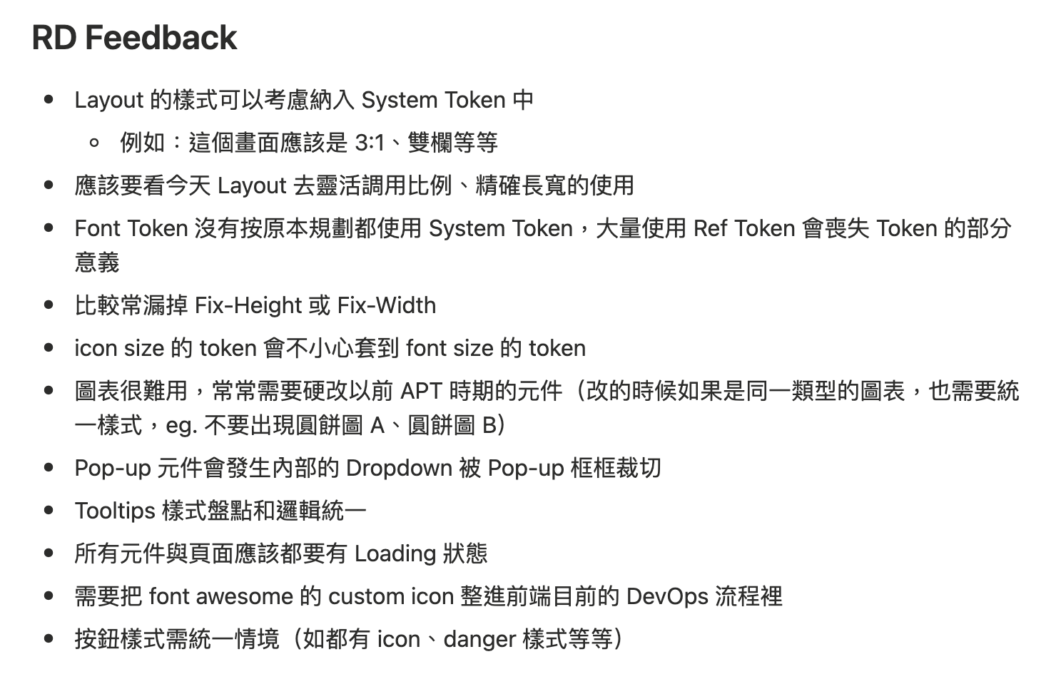
Raw notes from front-end teammates' feedback
Step 3|Synthesizing Into Three Pain Points
I categorized and organized all the feedback from both discussions into three major pain points, each mapped to its own solution.
Visual Style Refresh
Visual Direction
v1 used a neumorphism style — all those gradients and shadows didn't just strain Figma's performance, they also made front-end implementation and maintenance relatively laborious. In line with the “lightweight, clean” core goal, v2 switched to a flat visual language — replacing stacked light and shadow with clearer hierarchy and color, easing the burden on both design and development.
v1 visuals
v2 visuals
Design Output
Design Deliverables
01|Restructuring the Token Architecture
Tokens are the shared style source for design and front-end alike, defining rules like color, type scale, and spacing — they're the foundation of the whole design system. As the product keeps expanding, a token structure without room to grow makes component rework and future feature expansion difficult, so v2 chose to replan the token architecture starting at the semantic layer.
Before
Design tokens lacked room to grow
The initial token planning lacked flexibility — when new scenarios came up, the existing tokens were hard to reuse, so the only option was to keep adding dedicated tokens to cope. The sys layer gradually lost its semantic function, the spec grew increasingly unwieldy, and front-end maintenance costs kept piling up.
After
Planned the semantic layer around actual use cases
We stopped forcing every ref token to have a corresponding sys layer — semantic rules are only built for styles whose use case can be clearly defined, while everything else stays flexible and pulls directly from ref. Every sys token fully traces back to its ref source, with notes on its intended use case, giving front-end a clear basis when applying it.
02|Restructuring the Information Hierarchy
Security-drill execution logs can't be trimmed down — any single record could become the basis for a later investigation. So this phase focused on planning the order and timing in which data is presented, helping users quickly find what they need amid a huge amount of information.
Before
Dense information, hard to surface what matters
Important information couldn't be fully shown on the initial screen, most components were oversized with unclear hierarchy, forcing constant scrolling to see what was needed; details were dumped all at once into a popup, which covered the main screen and interrupted the workflow whenever it opened.
After
Restructured the information hierarchy to focus on what matters
Based on actual user feedback, we adjusted the information hierarchy — the outer layer keeps only the most important information, with the rest of the detail tucked into a dedicated detail area. A sidebar also replaced the popup, so viewing details no longer covers the main screen or interrupts the workflow.
03|Redesigning Components
v1 designed a fair number of special-case styles to match the visual style at the time; but as product strategy changed and the amount of information kept growing, the existing components gradually struggled to meet new needs, and the only option was to keep adding variants to cover each new scenario. Components proliferated and their responsibilities grew blurrier, so this phase redefined component boundaries, unified specs and use cases, and brought components back to a predictable, reusable state.
Before
Single-purpose components kept multiplying
Components of the same type evolved independently on different pages with no consistent standard for size or style — when a new scenario came up, the usual move was to copy and tweak, which kept bloating the component library and made it hard to tell which one to use during implementation.
After
Redefined component specs and use cases
Redefined component specs by use case, unifying size, style, state, and color rules. Components serving the same purpose converged into a single set, giving design and front-end one shared source of truth, and letting new pages reuse them directly.
Before
Frequently used features scattered, requiring constant jumping around
System resources, points, and user info were scattered across the Dashboard and settings pages — these features turned out to be used far more often than expected, so users constantly had to break their workflow and jump to a specific page just to check them. The nav bar sitting on the left also ate into the main screen's space, and its four main pages were shown as icons alone, making their purpose hard to guess.
After
Consolidated frequently used features into the nav bar
Consolidated the three heavily used pieces of information into the nav bar, so users no longer have to jump away from the current page. The nav bar also moved from the left side to the top, freeing up space on the main screen and cutting visual clutter; the four main pages now use self-explanatory buttons that don't require a hover to understand.
Sample Screens
Page Display
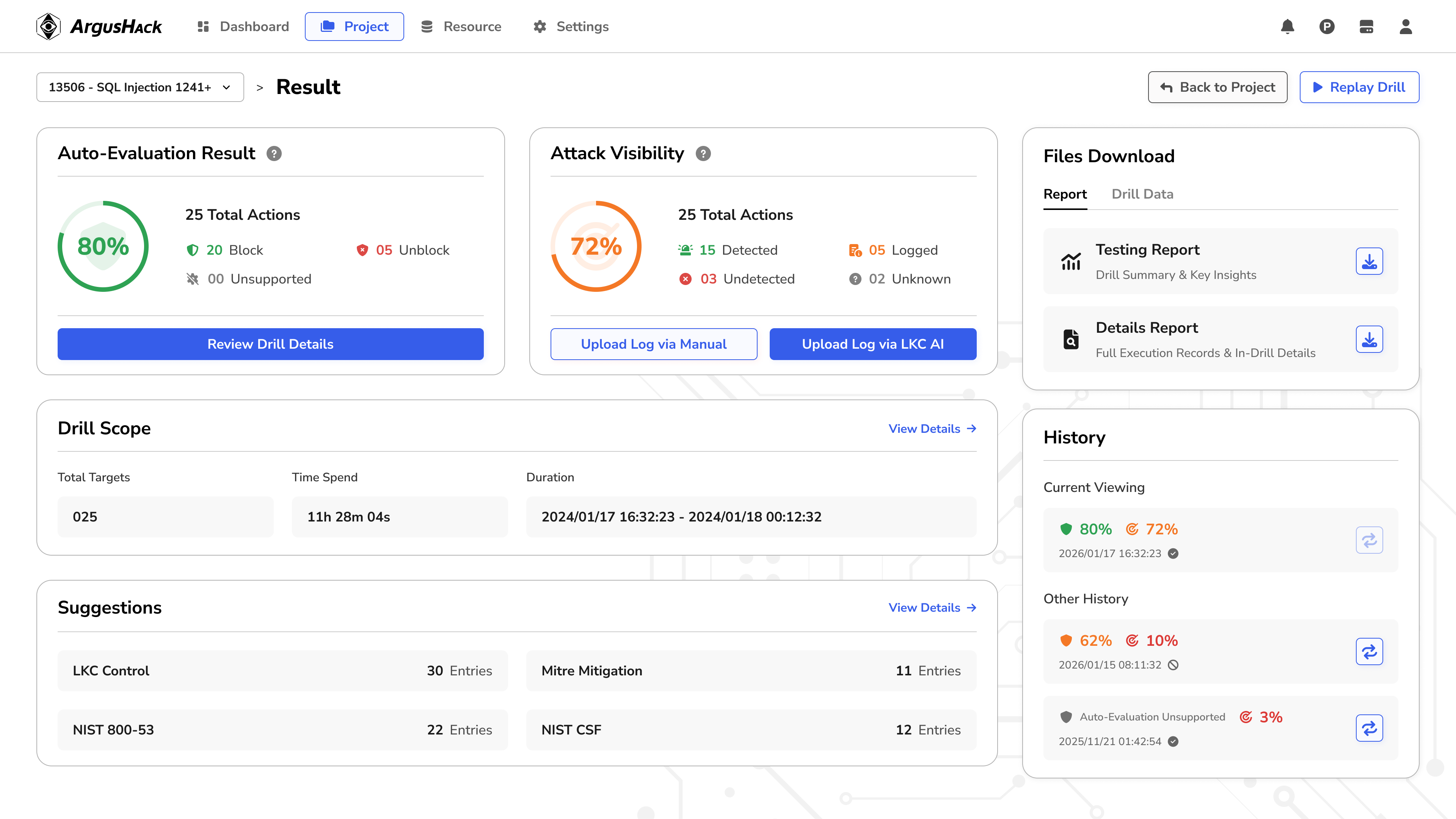
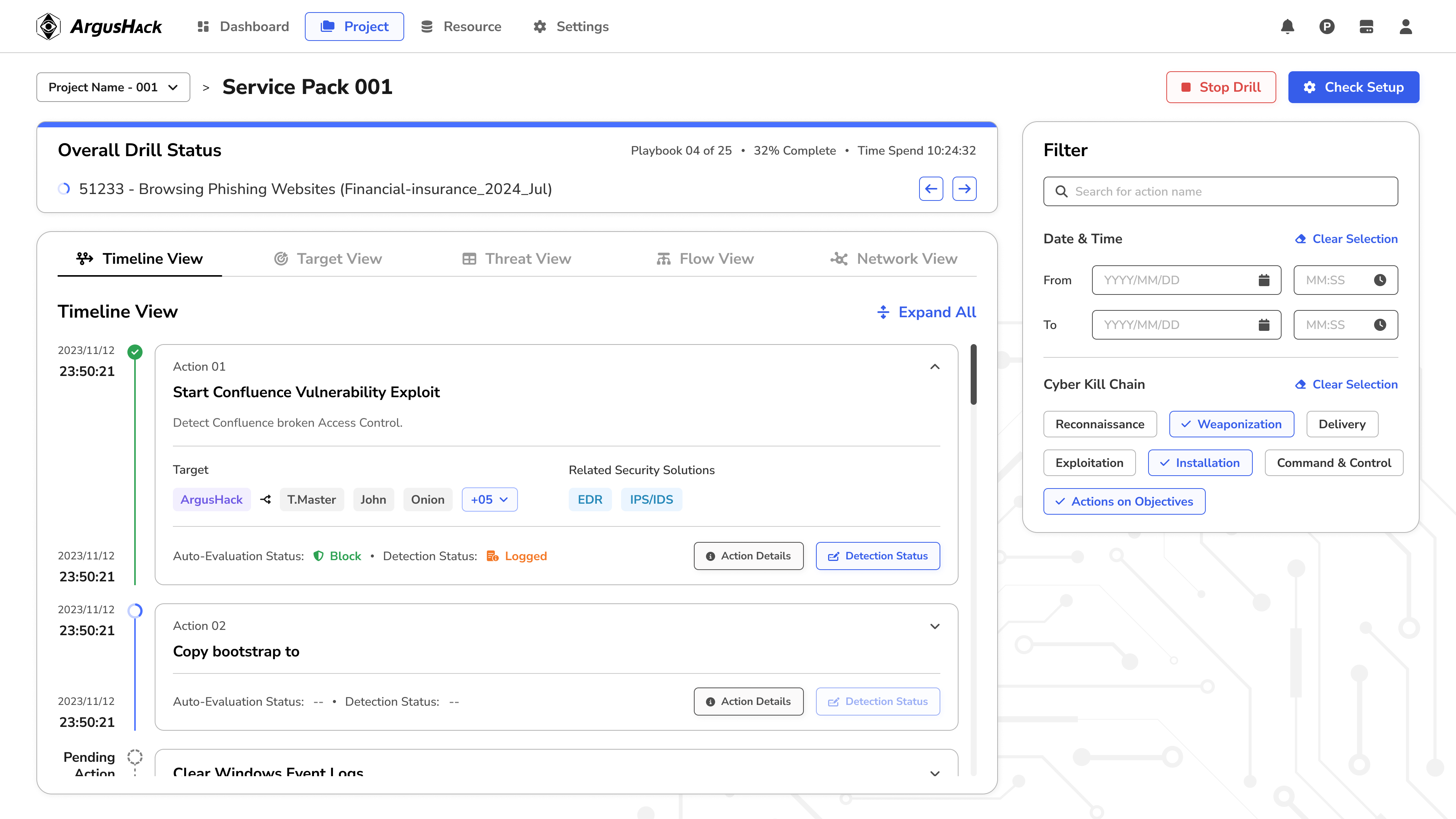
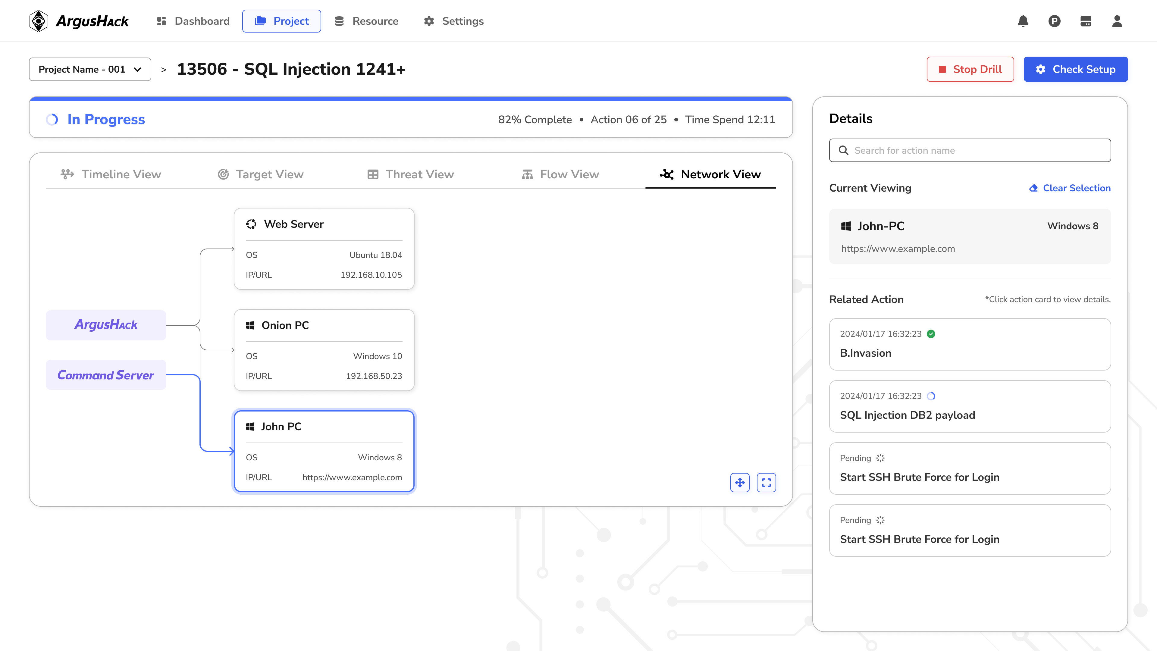
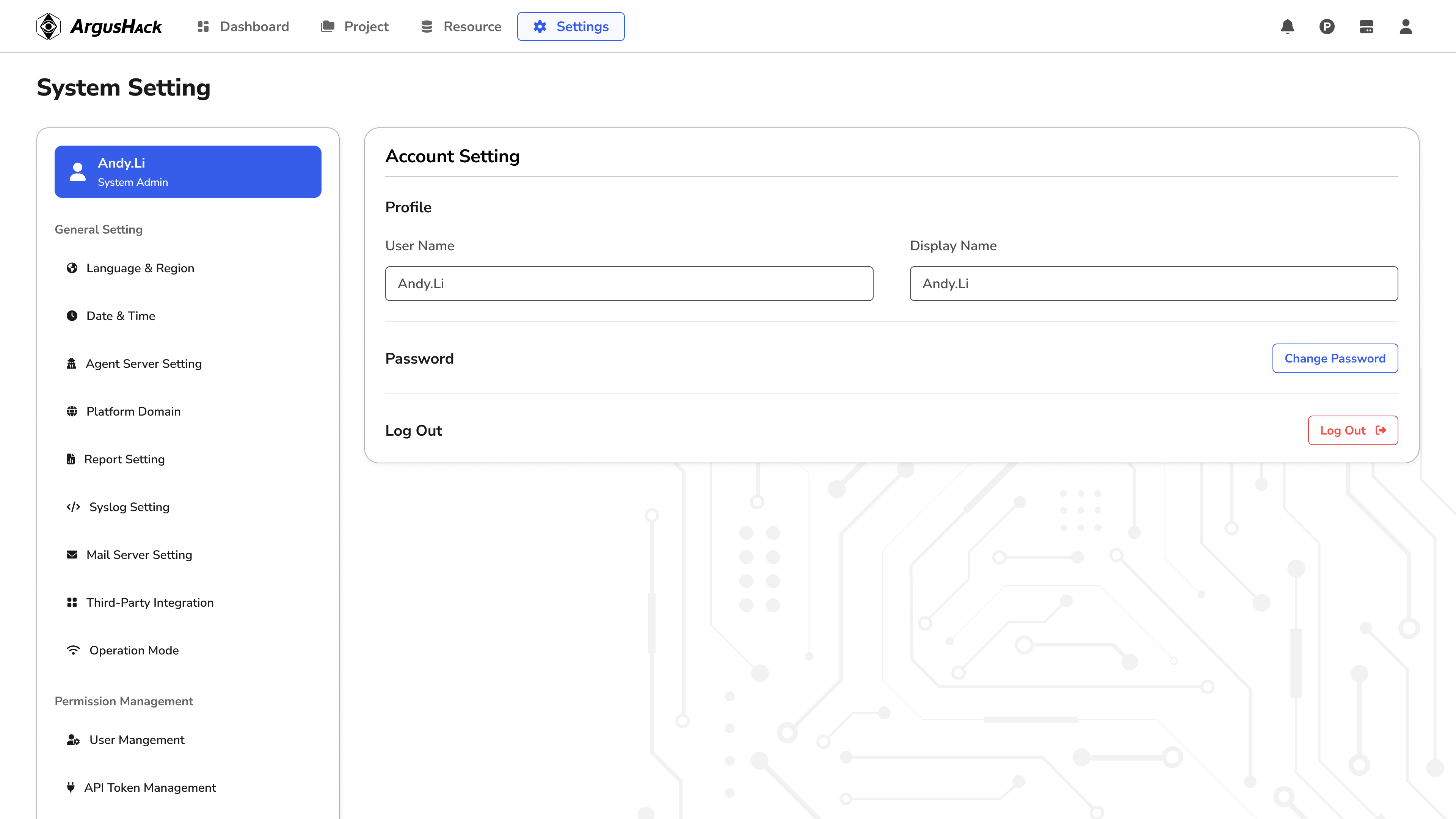
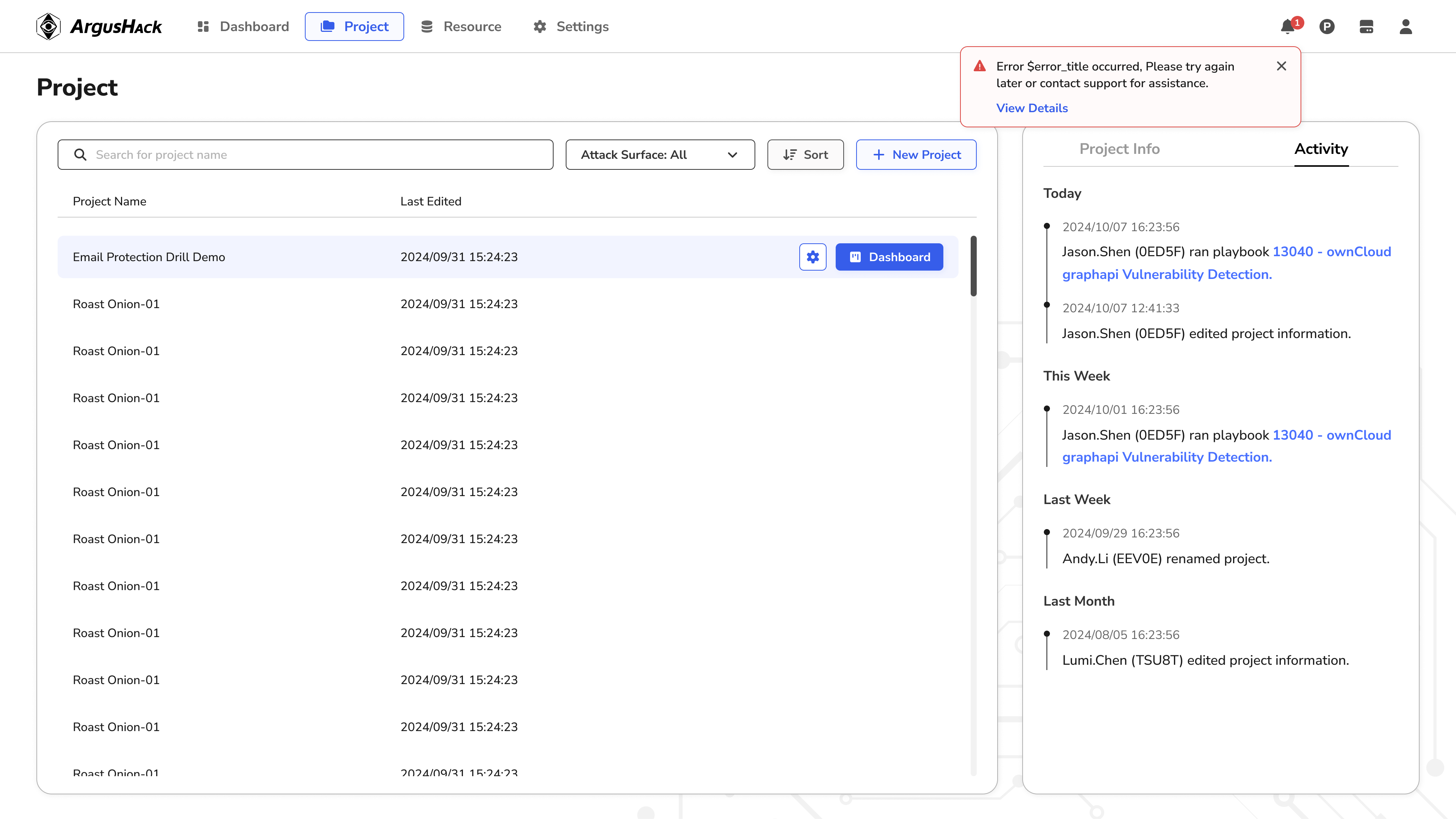
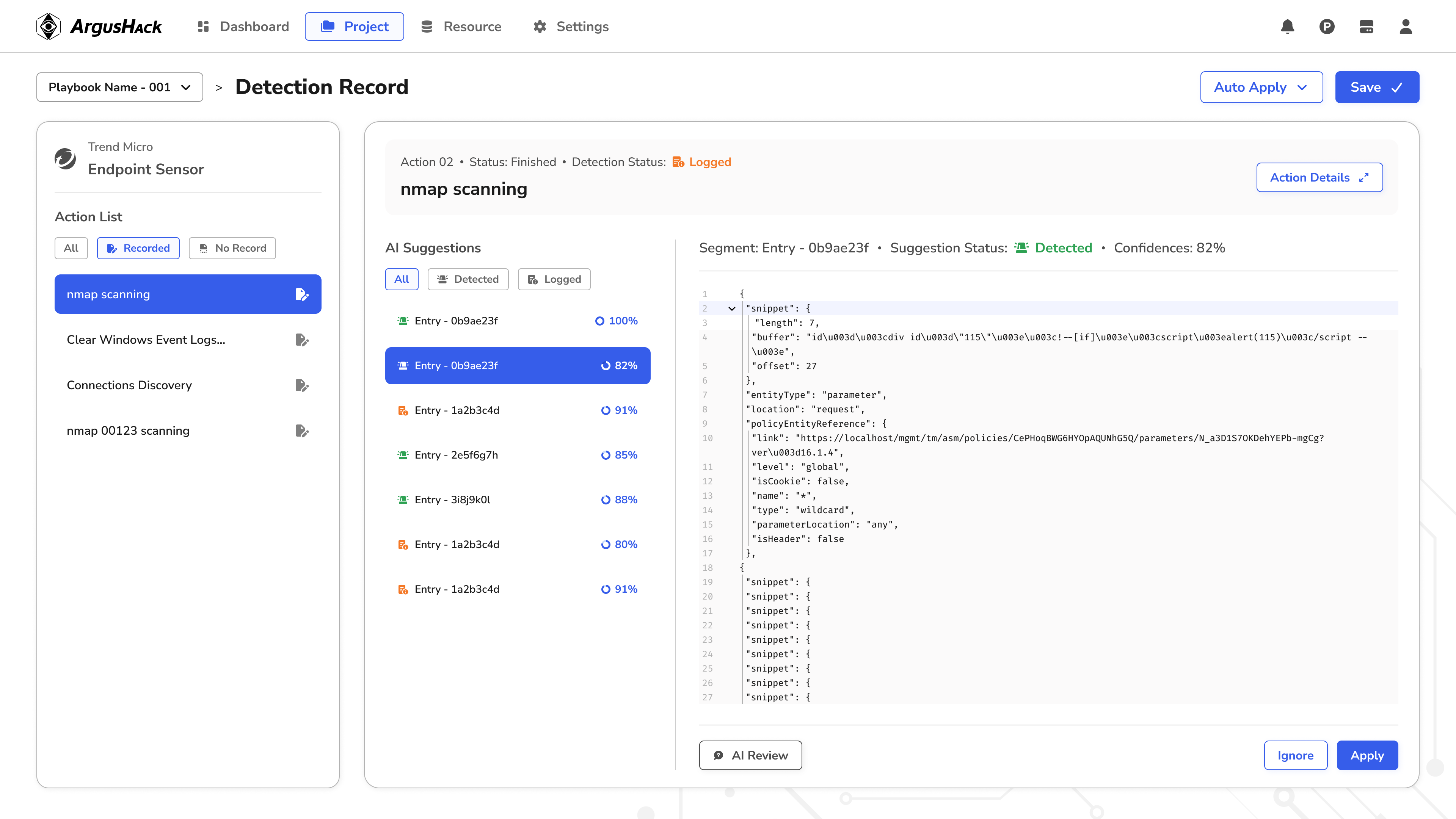
*This case study's content has been shared with my former company's consent; some details are omitted here — happy to go deeper in an interview.
Results
Results
From chaos to extensibility: rebuilding the design system's foundation
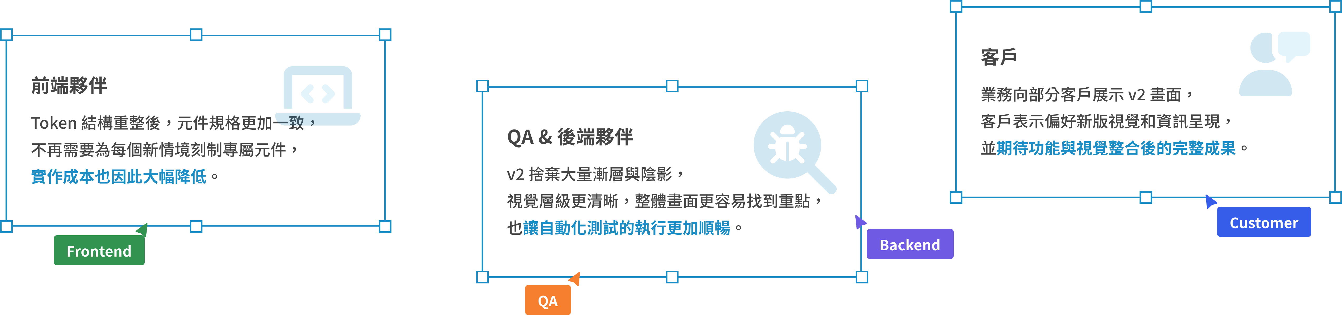
v2 restructured the information hierarchy and the spec itself, making the product more intuitive to use and the design easier to extend and maintain. After the project reached the development and QA stage, it started getting positive feedback from the product team and clients — it was later put on hold due to a shift in company operations and hasn't officially shipped yet.
Learnings & Reflections
Takeaways
Making well-rounded decisions under limited conditions
Clients of security products are especially sensitive about data collection, so getting user data through embedded tracking wasn't really an option. The most critical call in v2 was actually re-deciding “which information actually matters” — with no data to back it up, I had to converge on an answer relying on domain knowledge and cross-team validation instead. That taught me that even with limited information, I still need to lay the reasoning out for discussion rather than deciding by gut feel.
Finding the balance between completeness and pragmatism
Leading the systematic planning of a design system for the first time taught me not to over-design just for the sake of completeness — for example, the token architecture only builds a semantic layer for styles whose use case is clearly defined, instead of forcing every token to have a matching rule. That trade-off kept the system lighter and easier to maintain.